.avif)


Got something in mind?
Let's talk.
Let's talk.
info@bymoku.com


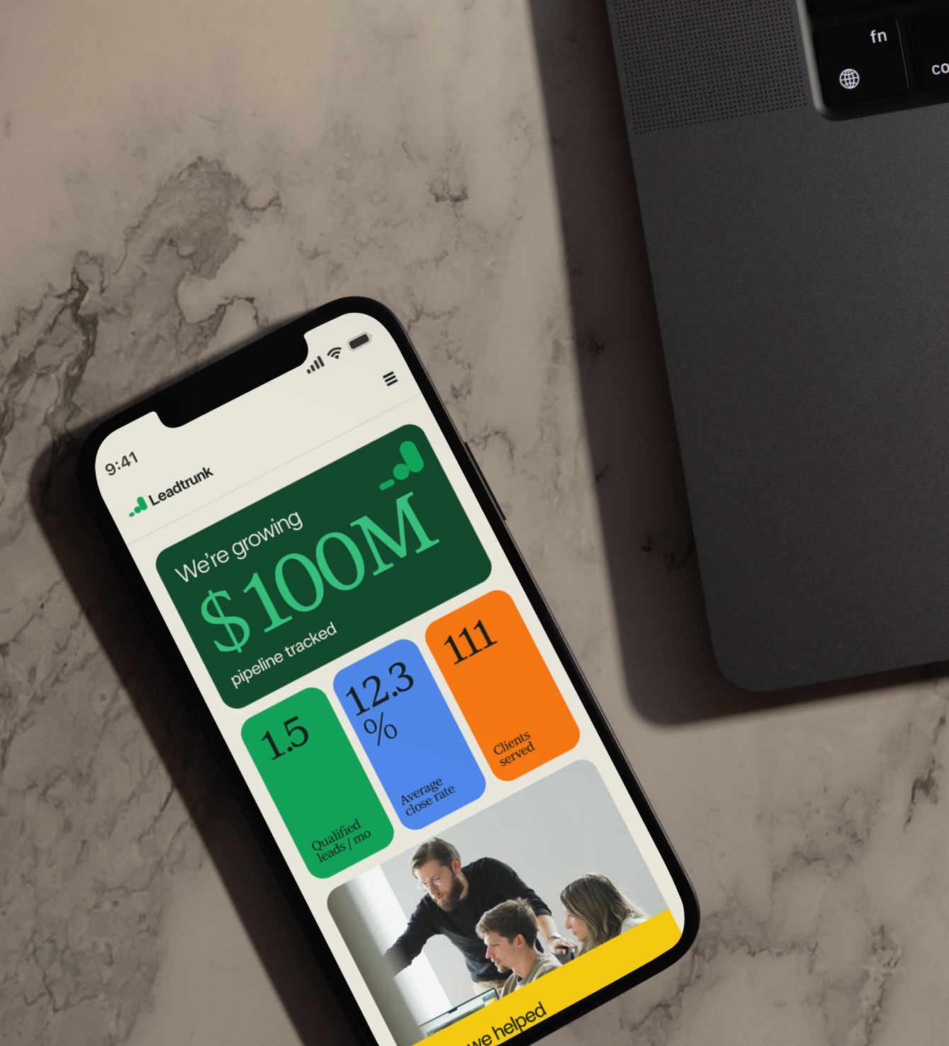
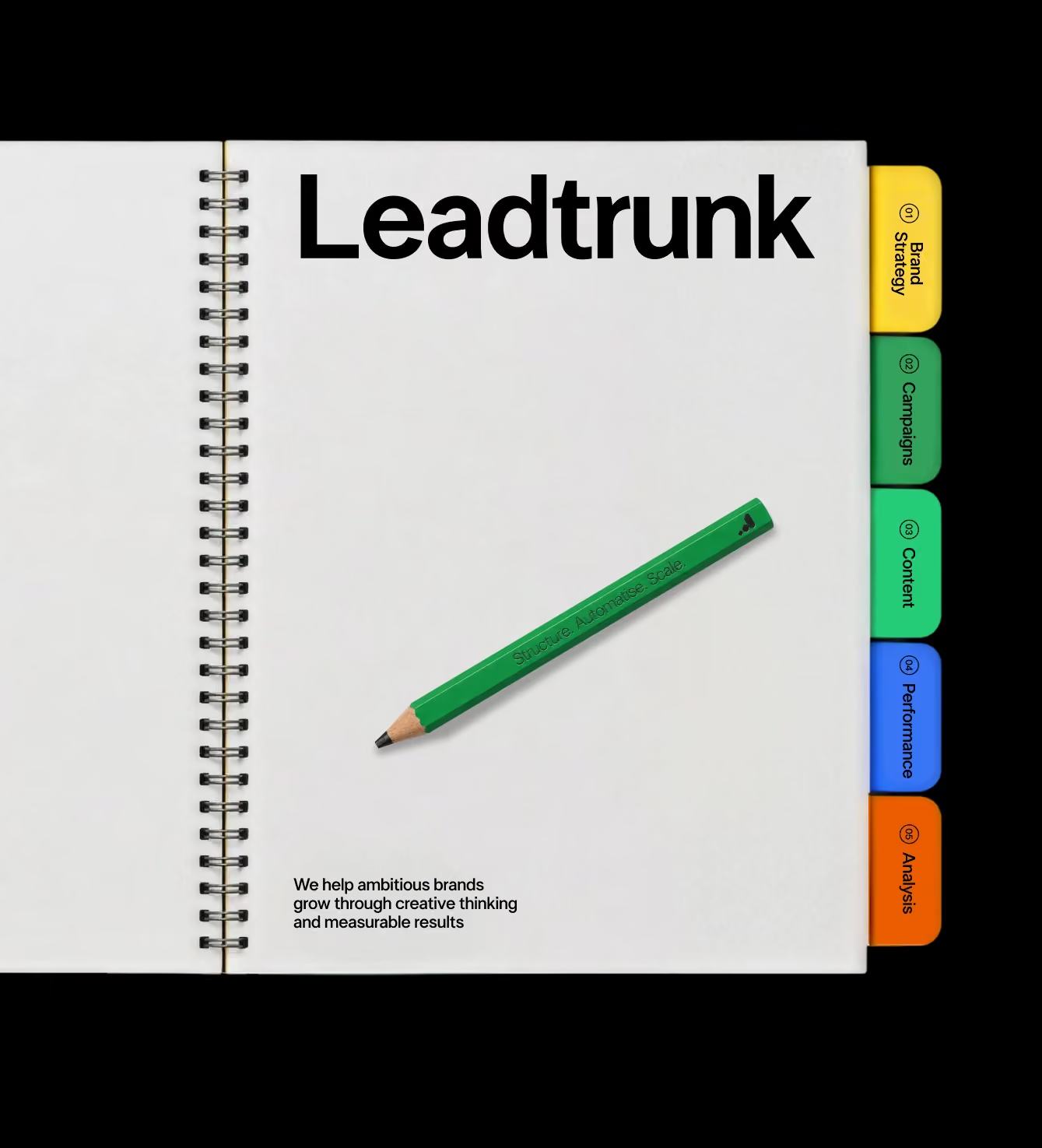
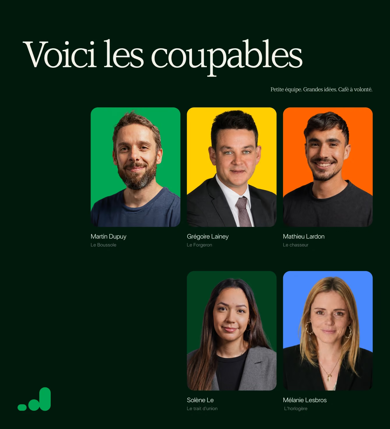
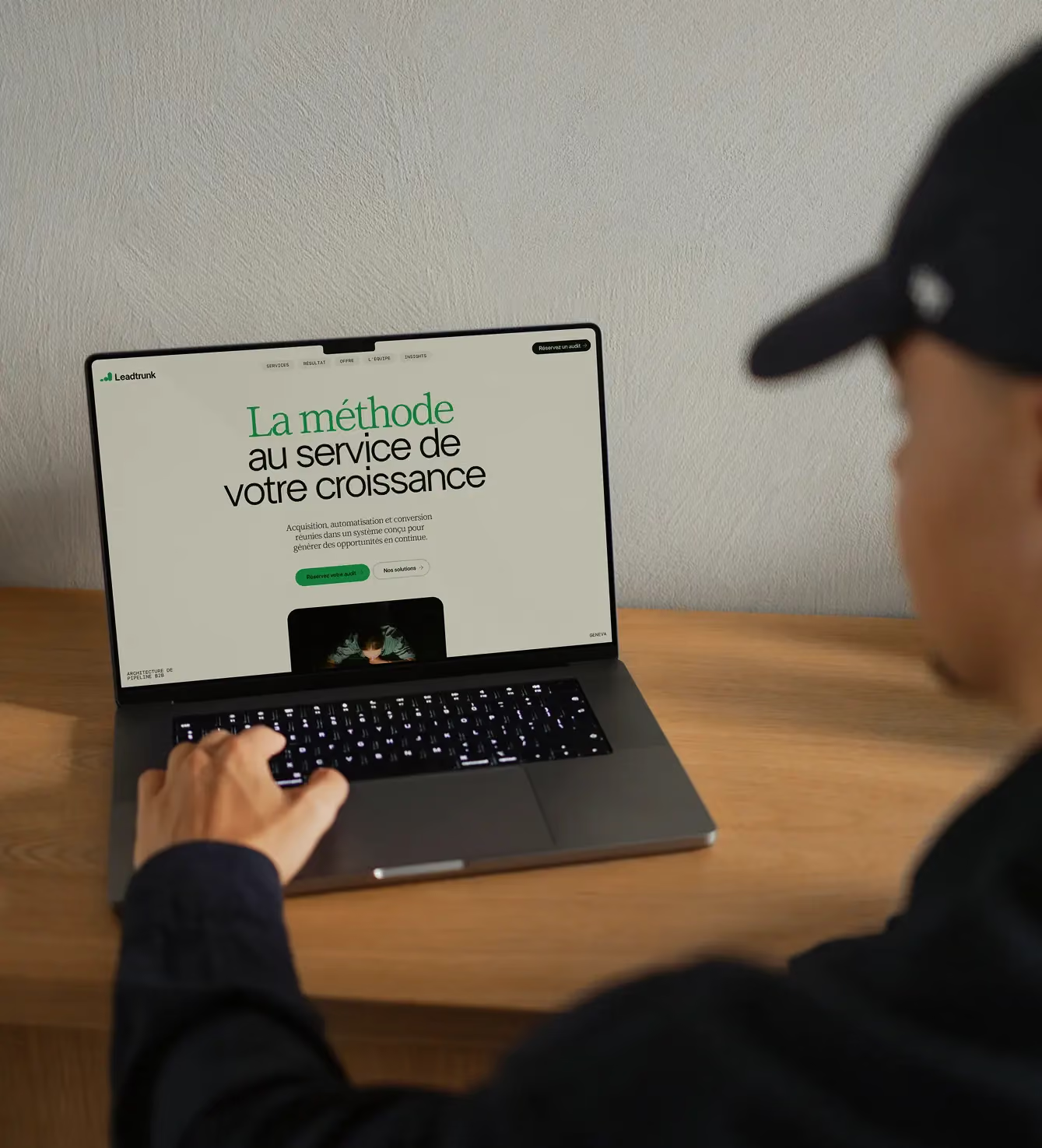
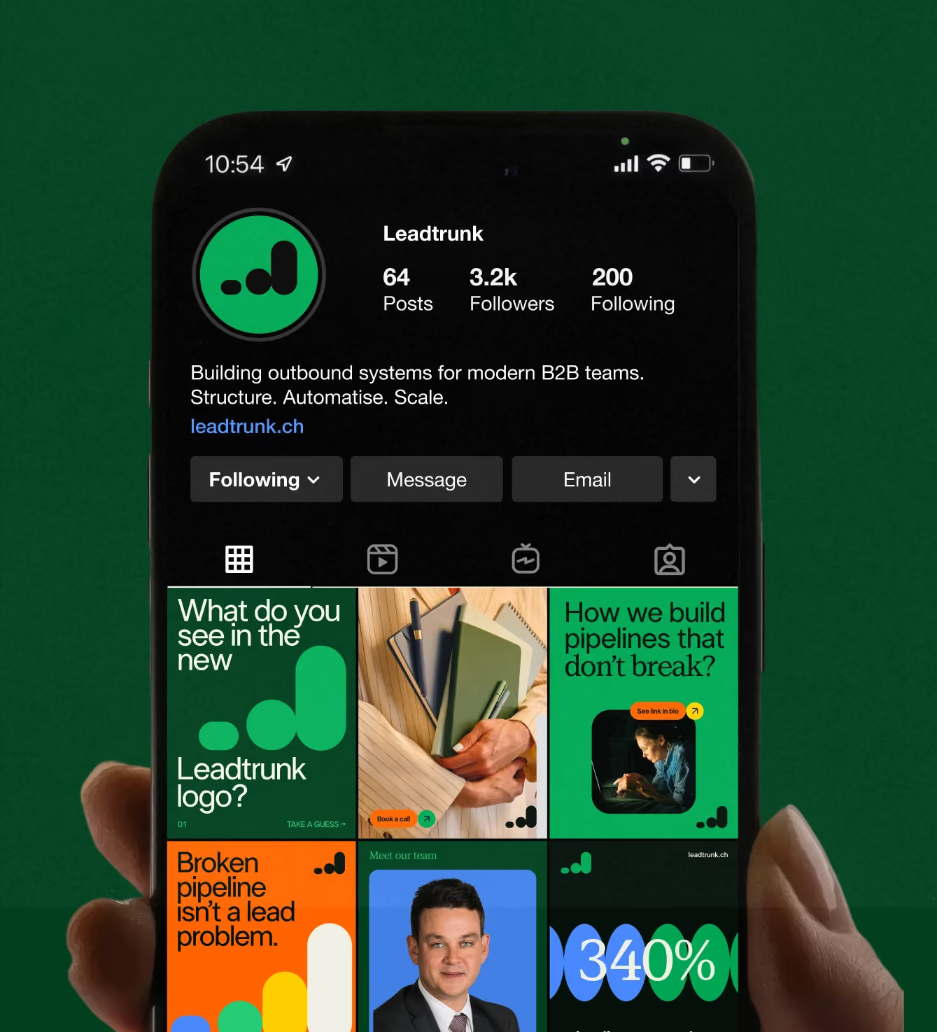
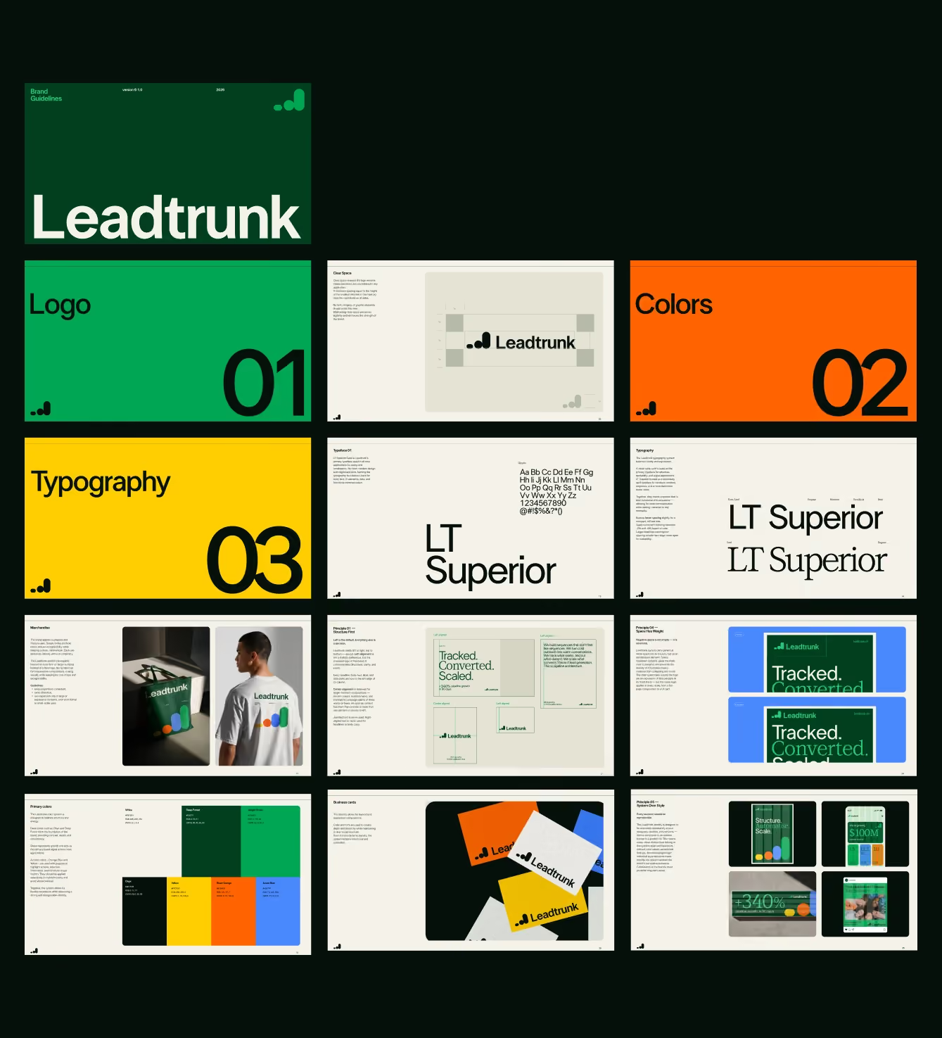
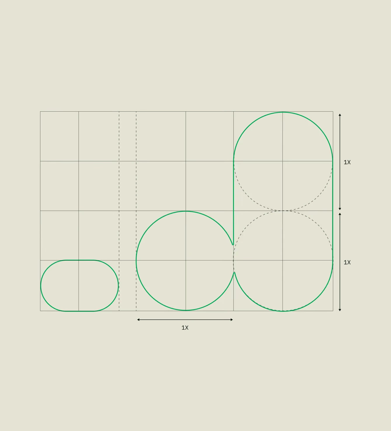
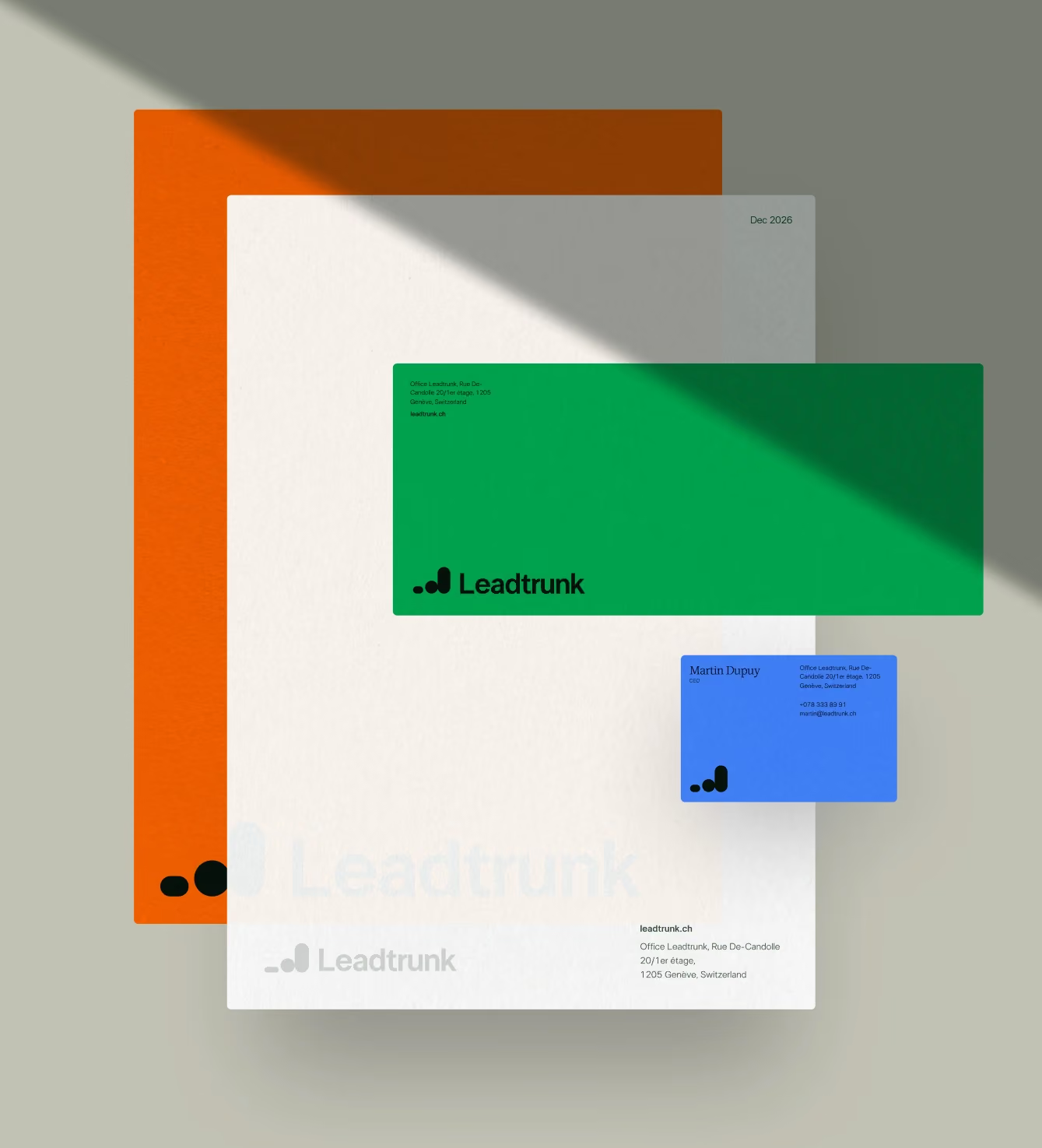
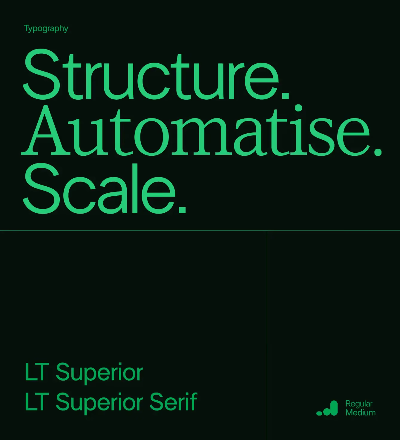
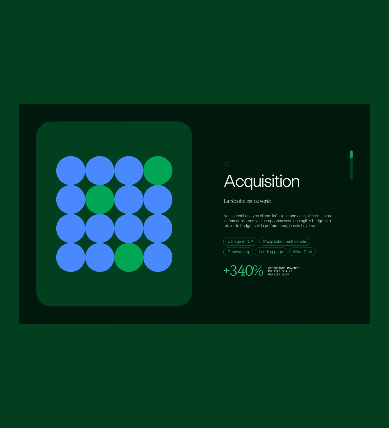
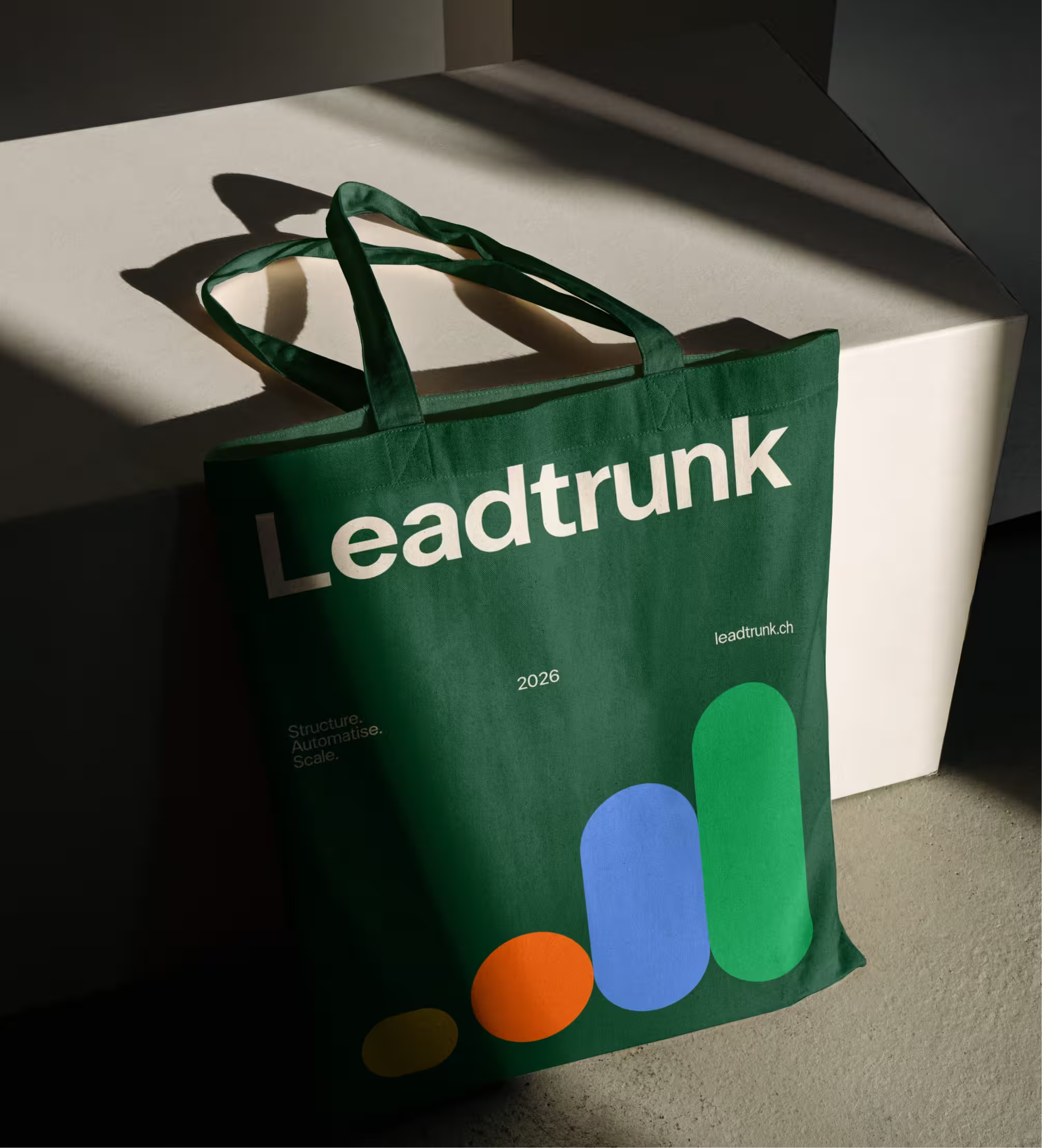
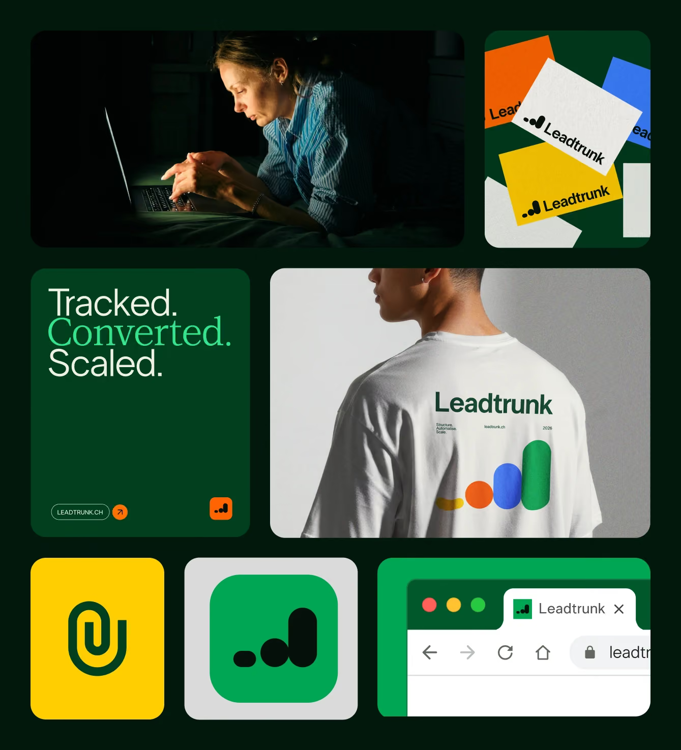
Two things were already working — the client's color direction and the core logo concept — so instead of starting over, everything was rebuilt around them. The logo's idea lived in negative space, and that became the throughline for the whole system: the gap is where the opportunity lives. It shaped not just how the brand looks, but how it speaks. From there, the work was about consistency — making the brand hold up the same way in a cold email, a pitch deck, and a full website, so the team never had to improvise. Every touchpoint runs on the same logic instead of being treated as a separate one-off, which is what lets a small team feel far bigger than it is. Leadtrunk now runs on one coherent system across every client-facing moment, from the first email to the final pitch deck — the website is live, and social content keeps building from the same foundation.

.avif)
.avif)