.avif)
.avif)

Got something in mind?
Let's talk.
Let's talk.
info@bymoku.com



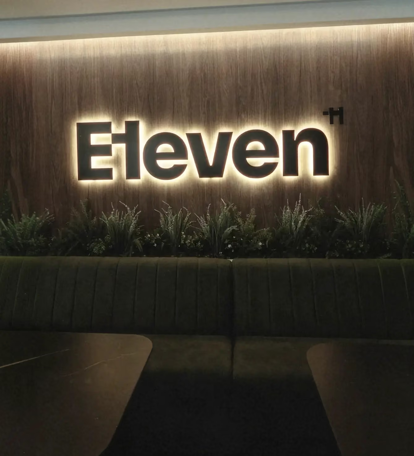
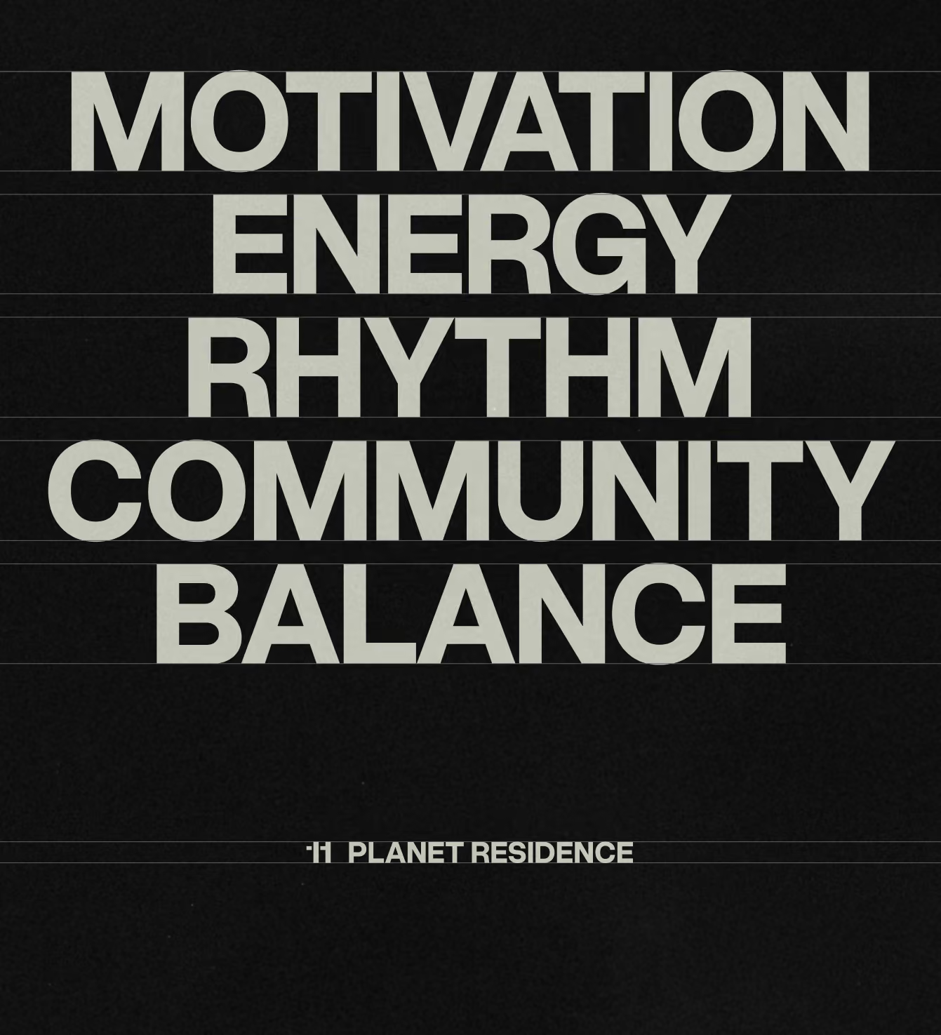
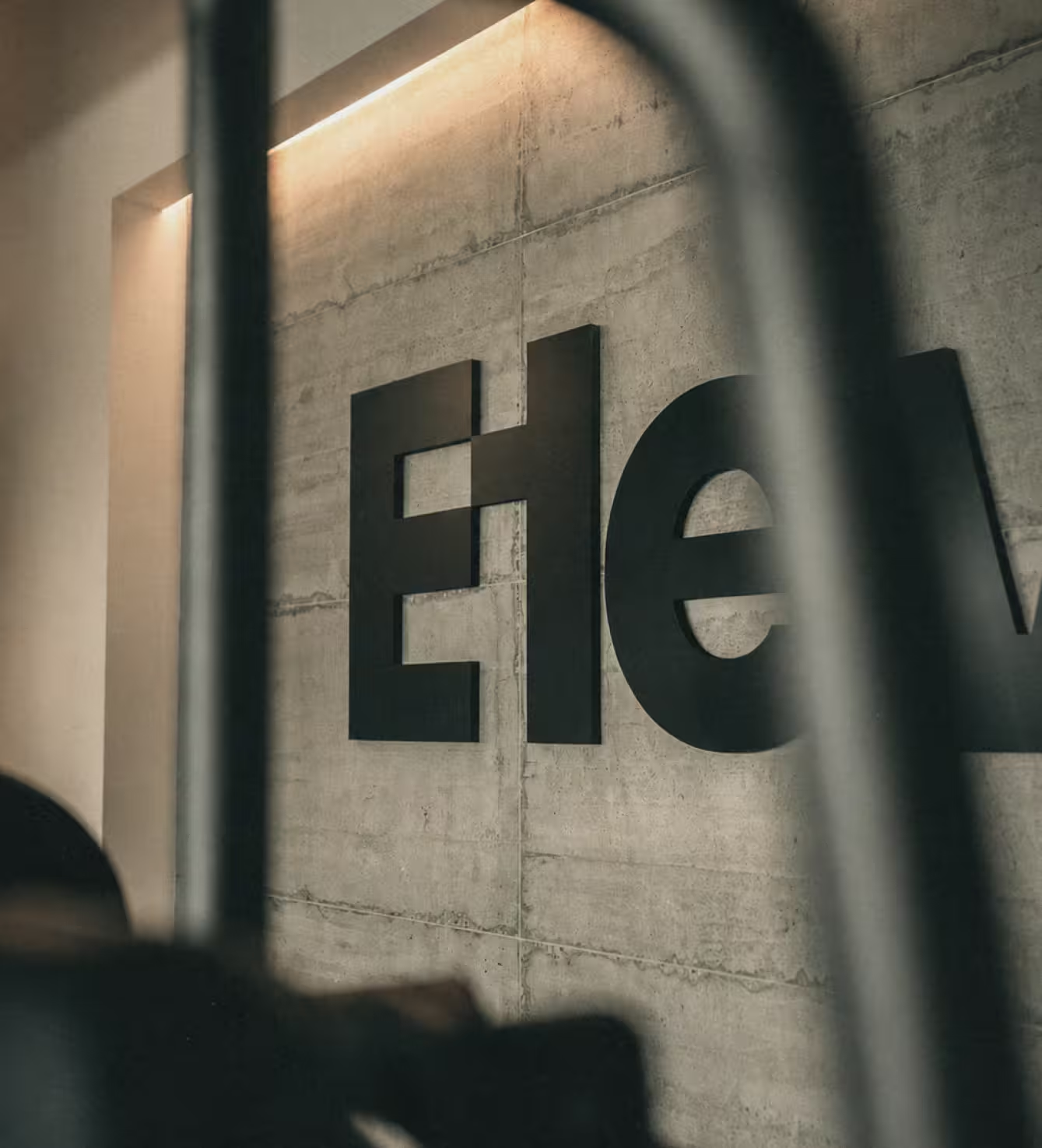
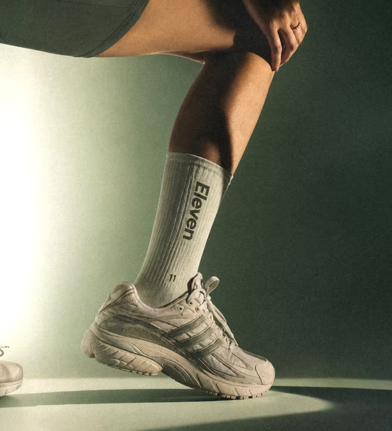
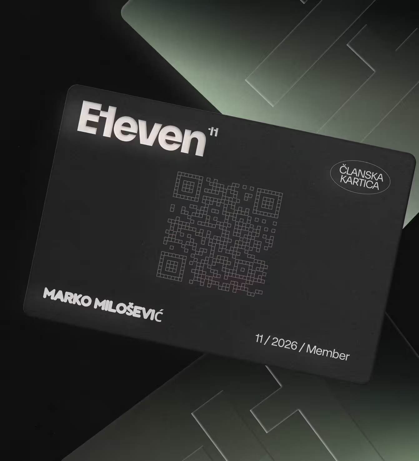
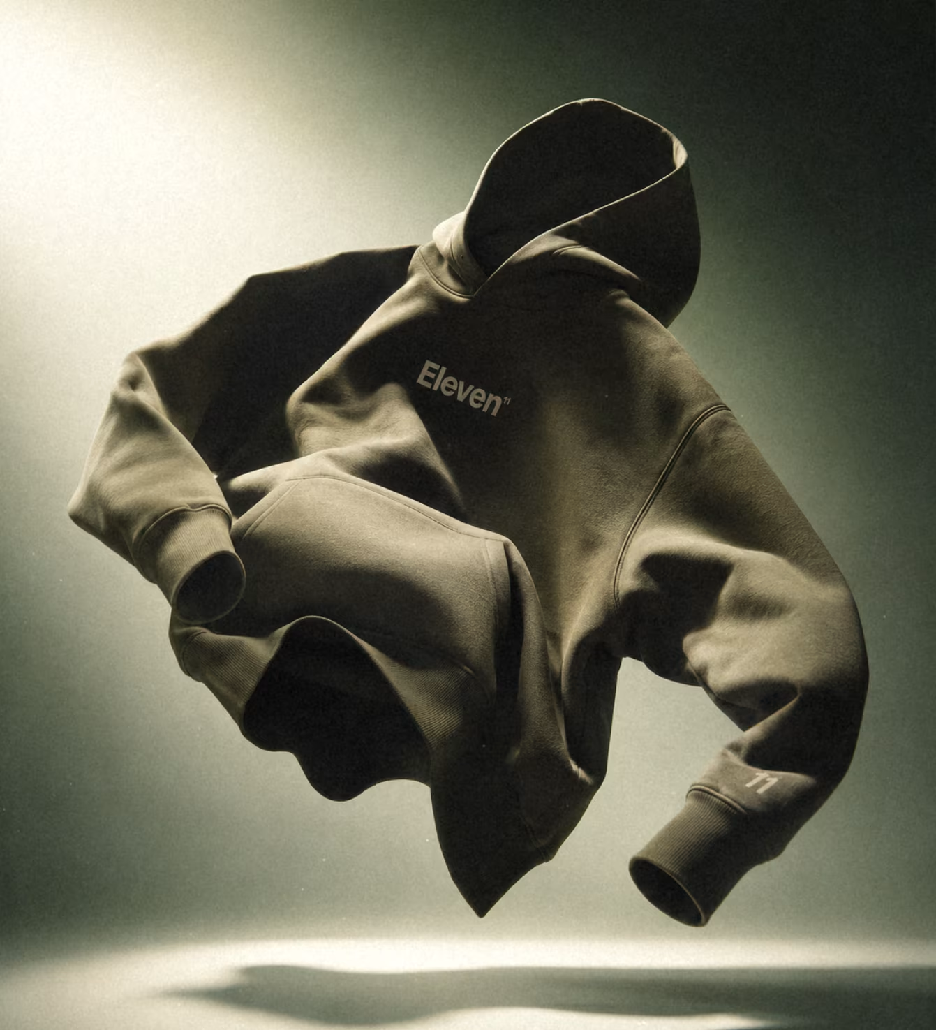
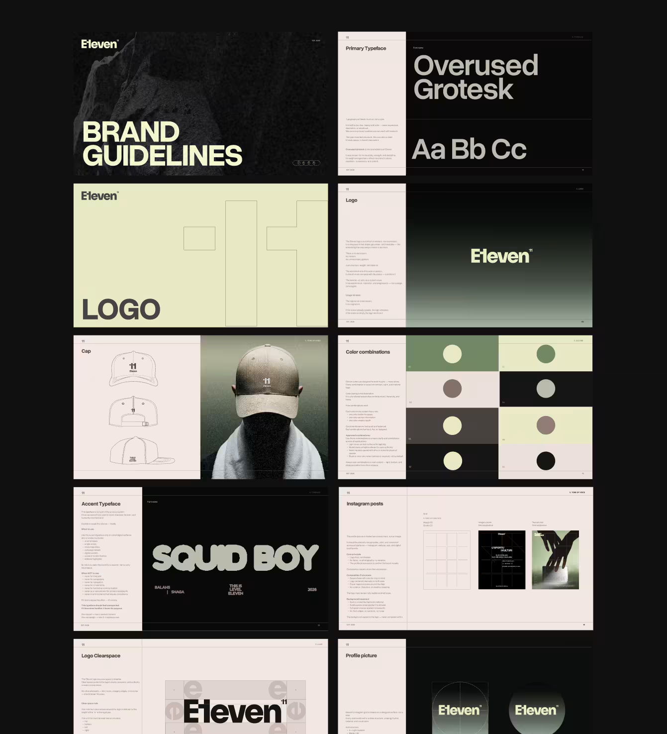
Working closely with the founder, the strategy took shape around restraint — built for a specific audience, not the mass market.Everything started with the name. The gym needed one that captured its whole reason for existing — going past the limit rather than just reaching it. Ten is max; eleven is beyond it. That idea became the foundation, and every decision built outward from it. The space itself leaned heavily on natural materials, so the brand did too: wood texture for the softer side — be gentle with yourself, recover, breathe — and stone for the push — the hard edge, the muscle, the discipline it takes to go further. The two hold each other in tension, the same way training does. Everything was built on one principle: the brand should never compete with the space it's in. If the room already speaks, the logo whispers. Eleven is open, the signage is installed, and the system is already live — in the gym, in the app, on the body.